Can you design a complete brand identity in less than a day? This question challenges many designers, especially when it encompasses everything from logo design to brand guidelines, business cards, and mock-ups. Typically, this process takes weeks, if not months. However, in this post, we’ll explore the journey of creating a brand identity for a fictitious company named Folio in just eight hours. Let’s dive into the steps taken to achieve this task and the insights gained along the way.
The Challenge: Creating a Brand Identity
The task at hand is to design a brand identity for Folio, a portfolio website that combines the features of social media with professional portfolios. Folio is unique because it does not utilize generative AI, ensuring that users can upload their images without them being used for data modeling. The challenge of designing this brand identity in a single day is not only about speed but also about maintaining quality and coherence.
Finding the Right Tools
To kick off a successful design project, many freelancers turn to tools like Gingersauce, a powerful platform designed to streamline communication between designers and their clients. With features such as customizable project proposals, built-in client briefings, and integrated payment systems, Gingersauce simplifies the management of various project aspects, making the entire process more efficient and seamless for both parties.
Step 1: Mood Boarding
The first step in the design process for Folio was creating a mood board, which serves as the visual foundation for the brand identity. Since Folio is designed for creative professionals, the mood board needed to reflect a modern, artistic vibe. Using tools like Milanote, a collection of images and color schemes was curated to resonate with the target audience. The goal was to craft an atmosphere that appeals to creatives seeking a professional yet visually engaging platform.
The mood-boarding process involved selecting visuals that conveyed the desired tone for the brand. Various color schemes were explored to connect with the creative community. Inspiration was drawn from existing logos and design elements, ensuring a unique yet familiar aesthetic.
Step 2: Mind Mapping
After mood boarding, the next step was mind mapping. This technique helped connect different ideas and themes related to Folio. Mind mapping is crucial for generating concepts and visualizing how various elements of the brand could relate to one another.
- Mind mapping allows for unexpected connections between ideas, which can lead to innovative design solutions.
- Key concepts like ownership, creativity, and social media were highlighted as essential components of Folio’s identity.
- This step provided a solid foundation for the subsequent design phases.
Step 3: Sketching Ideas
With a clear understanding of the brand’s essence, the next step is to sketch logo ideas. Using a digital tool like an iPad, it’s important to experiment with different lettering styles for the word “folio.” This phase is all about exploration and creativity, enabling the discovery of unique typographic designs that align with the brand’s identity.
- Sketching is essential for visualizing how letters interact and form a cohesive unit.
- Focused on creating a distinctive ‘O’ and ensuring that the overall design did not resemble existing logos, such as Fender.
- It was important to remain open to different styles and not settle too quickly on a single concept.
Step 4: Refining the Logo
Once a promising sketch is chosen, the next step in the design process is refinement. This stage involves transferring the design to Illustrator for precise adjustments, where every detail is fine-tuned to ensure the logo’s accuracy and balance. The refinement process is crucial, as it focuses on perfecting the finer details and ensuring consistency across all elements, resulting in a polished and cohesive final design.
- Using guides for x-height and ascender heights helped maintain proportionality in the design.
- Consistency in thickness across the logo was crucial for a polished look.
- Optical adjustments were made to ensure that the logo appeared balanced and visually appealing.
Step 5: Choosing a Color Scheme
Color choice plays a pivotal role in shaping a brand’s identity. For instance, selecting a ‘blurple’ shade, a blend of blue and purple, can evoke both creativity and modernity. This particular color combination is often chosen to convey sophistication while resonating with a creative and forward-thinking audience. By blending the stability of blue with the imagination of purple, brands can communicate a balance between professionalism and artistic flair.
- The color purple historically represents royalty and creativity, making it a fitting choice for Folio.
- Additional colors were generated using tools like Coolers to create a cohesive palette.
- Color schemes were selected based on their ability to reflect the brand’s values and appeal to its target audience.
Step 6: Creating Brand Guidelines
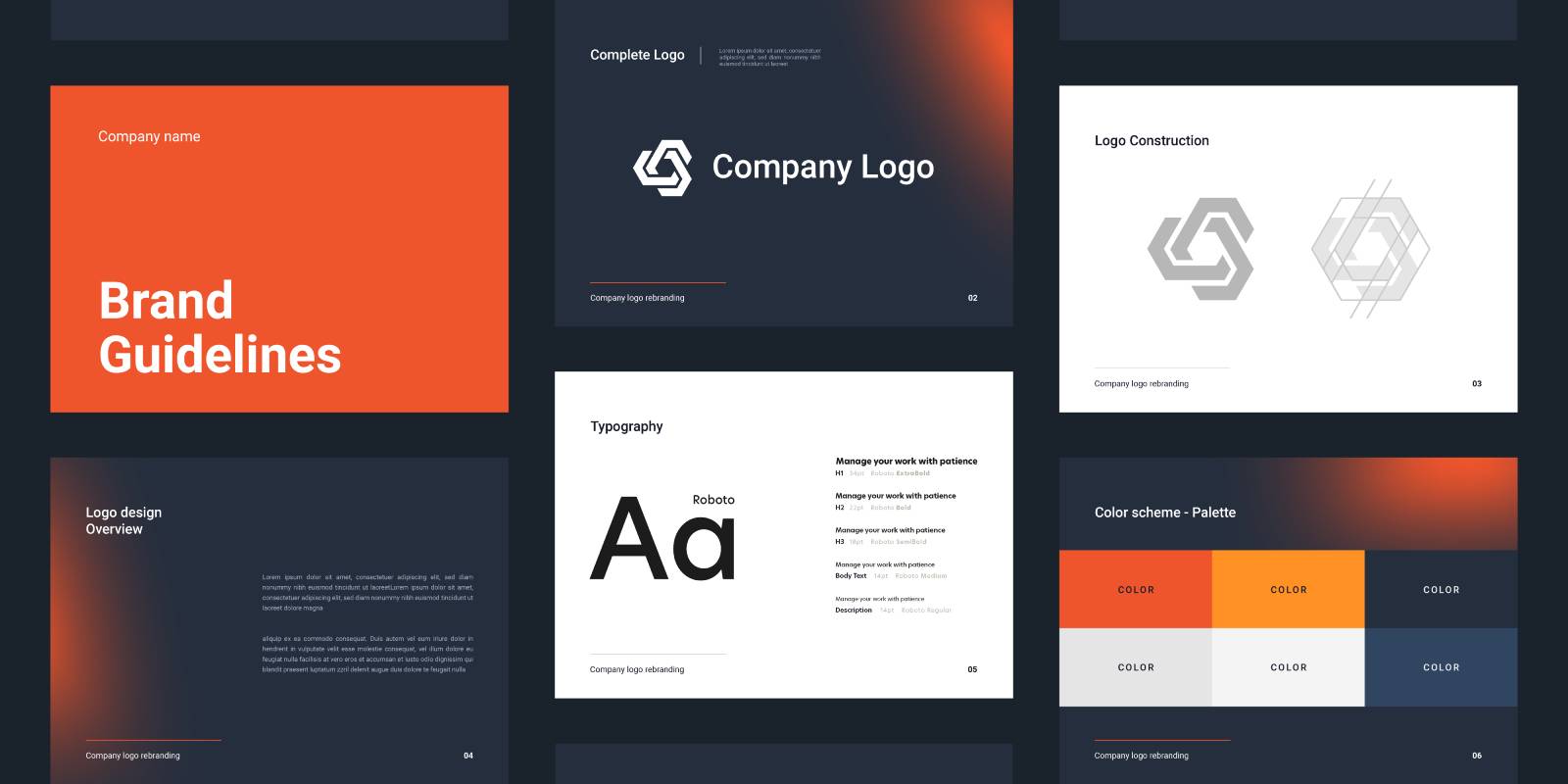
With the logo and color scheme established, the next step was to create brand guidelines. This document serves as a reference for how to use the brand elements correctly, ensuring consistency in all applications.
- Brand guidelines include rules for logo usage, color specifications, and typography.
- It’s essential to include do’s and don’ts to prevent misuse of the logo and brand elements.
- Utilizing a pre-made template streamlined the creation process, allowing for efficiency without sacrificing quality.
Step 7: Mock-Ups and Business Cards
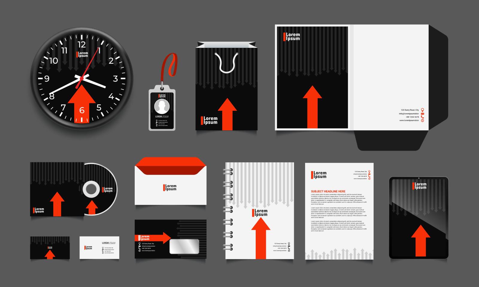
The final steps involved creating mock-ups and business cards. Business cards are a vital part of any brand identity, serving as tangible representations of the brand. Using a template, I designed a business card that aligned with Folio’s brand identity.
- Mock-ups help visualize how the brand elements will appear in real-world applications.
- Business cards were designed to reflect the brand’s personality and values.
- These elements are crucial for establishing a professional presence in the market.
Final Thoughts: Achievements and Limitations
Completing a brand identity in just eight hours is a formidable challenge. While it’s possible to create something functional and visually appealing in a short timeframe, the depth and refinement that come with a longer process cannot be underestimated. This exercise demonstrated the importance of thorough research, strategic planning, and creative exploration in branding.
Ultimately, while the design produced in this challenge was effective, the potential for a richer, more nuanced brand identity is evident when given more time. The experience reinforced the idea that great design is not just about speed; it’s about thoughtful consideration and a deep understanding of the brand’s essence.
Conclusion
Designing a brand identity is both an art and a science. The process requires creativity, strategic thinking, and a clear vision of the brand’s goals. While the challenge of completing this task in a single day was daunting, it also served as a valuable learning experience. For those looking to establish their own brand identities, take the time to explore, refine, and develop a clear understanding of what your brand stands for. In doing so, you’ll create a brand that resonates with your audience and stands the test of time.


