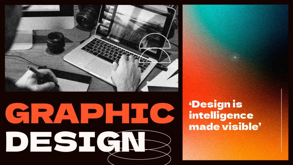
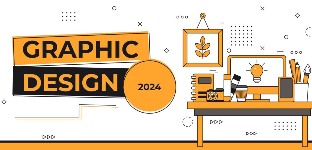
Graphic design is a field where even small adjustments can make a big difference. To help streamline the process and elevate results, here are seven practical, time-saving design hacks that improve colour, typography, logos, and composition. Each tip is simple to apply, easy to remember, and effective in creating polished, professional designs. Use these strategies as a quick reference to enhance your workflow and level up your creative projects.
Outline
- Tip 1: Create a harmonised colour palette in seconds
- Tip 2: Lock up a white logo (avoid the “glow”)
- Tip 3: Build a typographic system in minutes using the golden ratio
- Tip 4: Check logo uniqueness quickly
- Tip 5: Use the 60–30–10 colour method (plus a golden-ratio palette trick)
- Tip 6: Grid and balance a logo combination mark
- Tip 7: Optically align shapes — don’t trust math alone
- FAQ
Introduction
Design is full of small decisions that either make a project sing or leave it feeling off. Over the years I’ve developed simple, repeatable systems to remove guesswork. Below you’ll find quick methods you can use immediately in your favourite design apps. Each tip is practical, easy to remember, and saves hours of fiddling.
Tip 1 — Create a harmonised colour palette in seconds
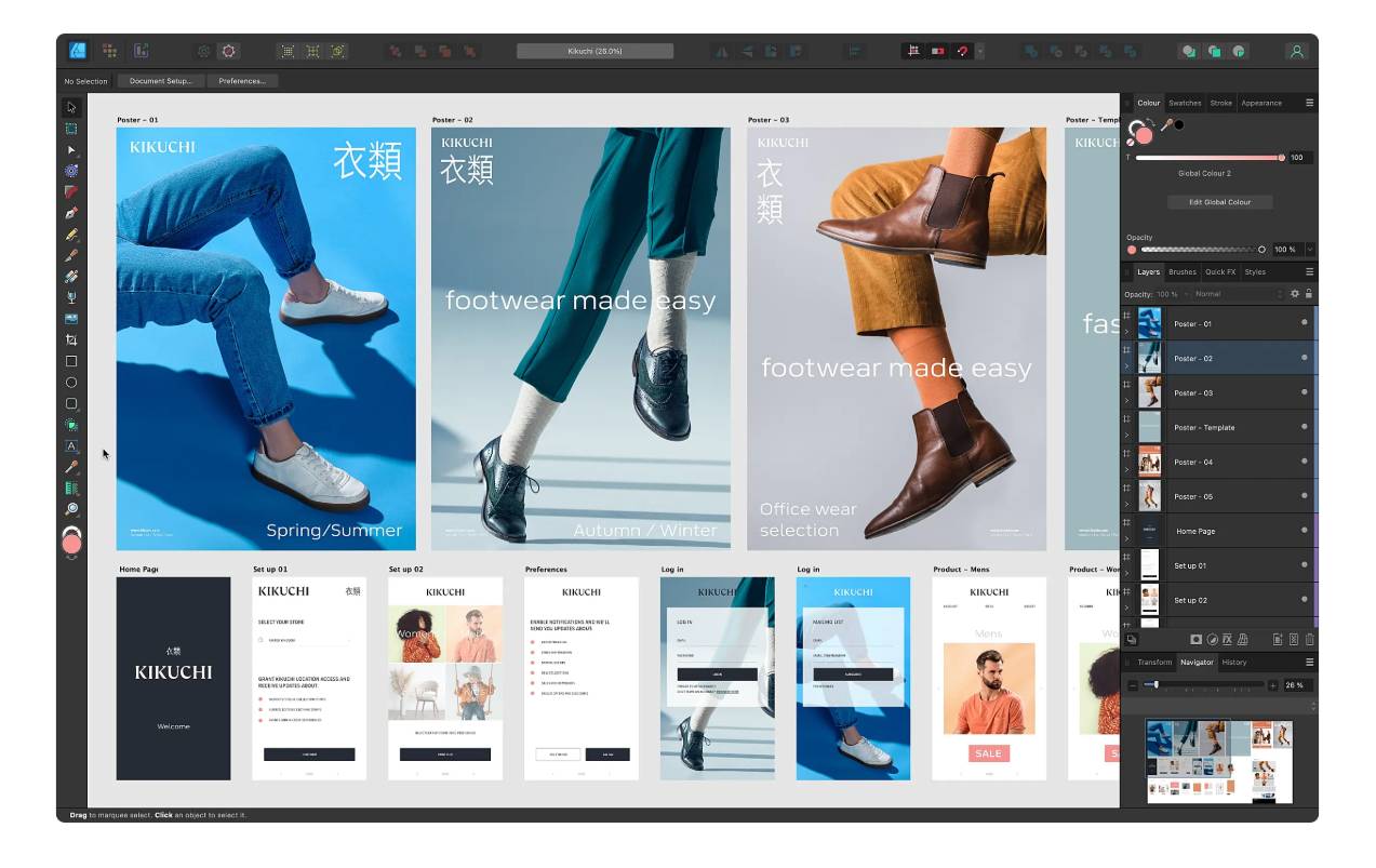
Got a mood board or a hero image you love? Turn it into a working colour system in a few clicks.
- Embed the image into your document.
- Use the “Create Object Mosaic” (or a similar feature) and set it to a grid of tiles — for example, 10 × 10.
- You’ll get lots of vector blocks filled with colours sampled from your image. Use the eyedropper tool to pick the tones you want and build a palette that matches the vibe instantly.
Result: a coherent palette derived directly from your reference with minimal effort.
Tip 2 — How to lock up a white logo (remove the “glowing” illusion)
White logos on dark backgrounds often look visually larger or “glowing” compared to their dark-on-light versions. The fix is subtle but effective:
- Increase the stroke on the white logo slightly and set the stroke to the inside.
- Adjust the stroke until the white mark reads optically the same size as the dark version.
- Convert the stroke to an outline (Object → Path → Outline Stroke).
- Use the Shape Builder (or boolean tools) to remove the extra outlined stroke that creates the glow on the dark background.
This removes the optical “mass” caused by the contrast and makes white logos feel the same weight as their inverted versions.
Tip 3 — Create a perfect typographic system in minutes
Type sizes and hierarchy can be tricky. Use the golden ratio to scale your sizes and establish a consistent system quickly.
- Decide on a comfortable body text size first — this is your baseline.
- In Affinity Publisher (or any tool that can scale values), multiply that size by 1.618 to generate the next headline size. Repeat to generate further levels.
- Lay the sizes out vertically, choose appropriate font weights for each level (e.g., bold for H1, medium for H2, light for smaller headings), then save them as paragraph styles.
Why it works: the golden ratio gives visually pleasing proportions. Once set, your type hierarchy becomes consistent and reusable across a whole document or brand system.
Tip 4 — How to check if your logo design is unique
Finalising a logo only to discover it’s already been used is a nightmare. Don’t skip this quick check:
- Use the Global Brand Database (or similar trademark resources): upload the logo and search for conceptually similar marks to see registered logos that may be close to yours.
- Use reverse image search (Google Images): drag your logo into the image search to find visually similar logos or marks on the web.
Don’t sleep on checking your concepts — it takes under a minute and can save you rework and legal headaches.
Note: these methods are good for early vetting but are not legal advice. Always consult a trademark attorney for legal clearance.
Tip 5 — The 60–30–10 colour method (and a golden-ratio hue trick)
A simple rule to keep colour usage balanced:
- Primary colour: 60%
- Secondary colour: 30%
- Tertiary / accent: 10%
This gives your compositions a controlled colour language and prevents one colour from overpowering the rest.
Bonus (Tip 5.5): use the golden ratio to generate harmonious hues. Starting with one hue value, multiply by ~1.618 to get a second hue, and repeat for a third. This is a quick way to produce a cohesive palette with pleasing relationships.
Tip 6 — How to grid a logo combination mark
Balancing an icon with logotype is often subjective. Use a simple grid system to remove the guesswork:
- Create guide lines based on the cap height and baseline of your type, then split that vertical space into thirds or other repeatable units.
- Align the icon to fit within that grid so the icon and text relate visually through shared proportions.
- Alternative: use a 3×3 grid (or repeatable modular grid) so typography and icon sizes and paddings are derived from the same system.
Why it works: when position, size and padding relate to a consistent system, the mark reads as intentional rather than arbitrary.
Tip 7 — Don’t always trust mathematical alignment — optically align
Some shapes need optical adjustments. A mathematically centred triangle inside a square can look visually off even though it’s perfectly aligned numerically.
- After using alignment tools, step back and eyeball the lockup.
- Make small nudges so the composition reads as visually centred — this is optical alignment.
Designers must learn to balance precision with visual judgement. Trust your eyes when the math doesn’t look right.
Extras — Tools I use
- Affinity Designer / Publisher — great for mosaics, typographic workflows and vector editing.
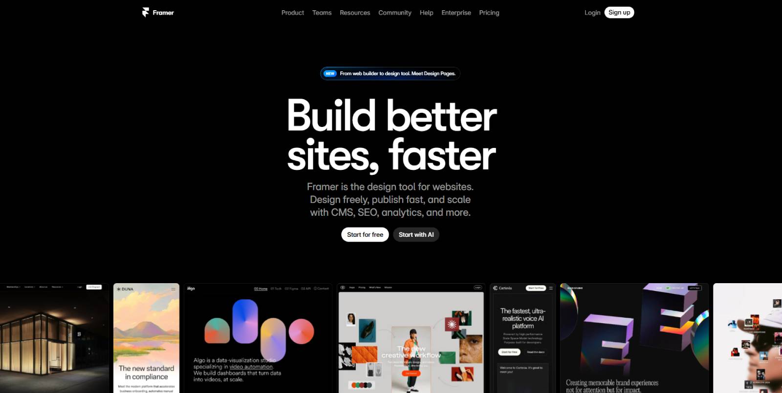
- Framer — excellent for building no-code prototypes and websites quickly (use templates to accelerate development).
Conclusion
These seven hacks are small techniques with big impact: quick colour extraction, fixing white logo glow, a golden-ratio type scale, fast trademark checks, a simple colour usage rule, grid systems for combination marks, and optical alignment. Use them together and your projects will start to feel more polished and deliberate.
FAQ
What software do I need to follow these tips?
Most of these tips can be applied using mainstream vector and layout applications. Tools like Affinity Designer and Affinity Publisher are well-suited for tasks such as creating mosaics, outlining strokes, and scaling typography. Similarly, Adobe Illustrator and InDesign offer the same capabilities. For web builds, platforms like Framer provide an efficient solution.
Is the golden ratio required for typography and colour?
No — it’s a helpful tool to create visually pleasing proportions quickly. It’s a guideline, not a rigid rule. If you prefer another scale that works for your brand, use that. The benefit of the golden ratio is consistency and aesthetic harmony.
How thorough is a quick logo uniqueness check?
A reverse image search and global brand database search are fast and useful for spotting obvious conflicts. They do not replace a legal trademark search or counsel. For final sign-off or commercial use, consult a trademark professional.
What’s the difference between mathematical and optical alignment?
Mathematical alignment uses coordinate-based centring and equal spacing. Optical alignment adjusts elements by eye so they appear visually centred or balanced. Some shapes (like triangles) need optical nudging to read correctly even if they’re mathematically centred.
How strictly should I follow the 60–30–10 rule?
It’s a practical starting point for balanced colour distribution. Many successful designs deviate from it for creative reasons, but if you struggle with colour balance, the rule gives you an immediate system to follow.